
Analyzing 30 Years of Census Data with Dot Density Maps in HEAVY.AI
Try HeavyIQ Conversational Analytics on 400 million tweets
Download HEAVY.AI Free, a full-featured version available for use at no cost.
GET FREE LICENSE
I remember the first time I saw a dot density map. It was back in 2010 when the University of Virginia released the racial dot map with that years' decennial census.
Transfixed with how the dot density map represented population distribution, I observed the effects of segregation, immigration, and gentrification like never before. When a dot symbolizes a person (or 100 people), there's just something surreal about recognizing how and where we've clustered across the continent.
Fast forward to today, and the US 2020 Decennial Census results are slowly starting to come in. The redistricting results landed in August 2021, and the newest set of American Community Survey (ACS) data will come out in late November 2021.
This census GIS data has enormous public policy implications like congressional redistricting, representation, gerrymandering, and a general understanding of US population distribution and how demographics change locally and nationally.
You may be asking, what is a dot density map? Dot density maps are an intuitive method for demonstrating how humans cluster together or disperse across an area, which is particularly valuable when visualizing demographic data or voting results.
While they've been used for some time, dot density maps have recently gained more clout with the 2010 Racial Dot Map, the New York Times' Mapping Segregation, or even this cheeky XCKD map (with 250k people per dot) of the 2020 election results.
The challenge with most dot density maps is they're often slow (hundreds of millions of points is a lot!). They aren't very interactive beyond zooming/panning and don't allow us to understand changes over time. We wanted to fix this, and thanks to HEAVY.AI, we can.
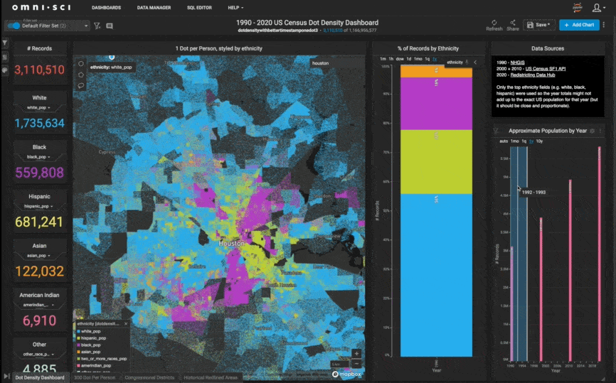
We took population density dot maps one step further by creating a set of Dot Density Dashboards. These dashboards have data from the 1990, 2000, 2010, and 2020 censuses, representing over a billion points at the one person to one dot resolution.
With these three decades of data and intuitive maps and charts, we end up with a set of dashboards that allow us to explore and interrogate 30 years of US census data population density changes at the very granular census block group level.
To best show you all the results and how we made it possible, we've prepared a three-part blog series, a collection of videos, and published a public demo so you can explore your neighborhood or hometown.
This three-part blog series will show you the following:
The first part (the remainder of this post) will explore some of the surprising knowledge gained from the analysis and visualizations.
The second part will discuss how we acquired the data for each census and the Python notebooks used to turn the census block group polygons into individual points.
The final part will explore how we created the charts, maps, and dashboards in HeavyImmerse.
Let's jump into the results!
Knowledge Gained
This part of the series will focus on interesting patterns and themes we discovered using the dot density dashboard.
Population Losses and Gains
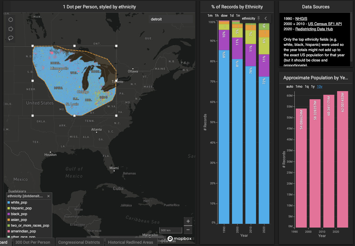
It's fun to use the map lasso tool to see overall population trends over the last three decades. You can see that the Southwest and Texas have nearly doubled in population in that time.

Whereas the midwest's population increases have been much lower.
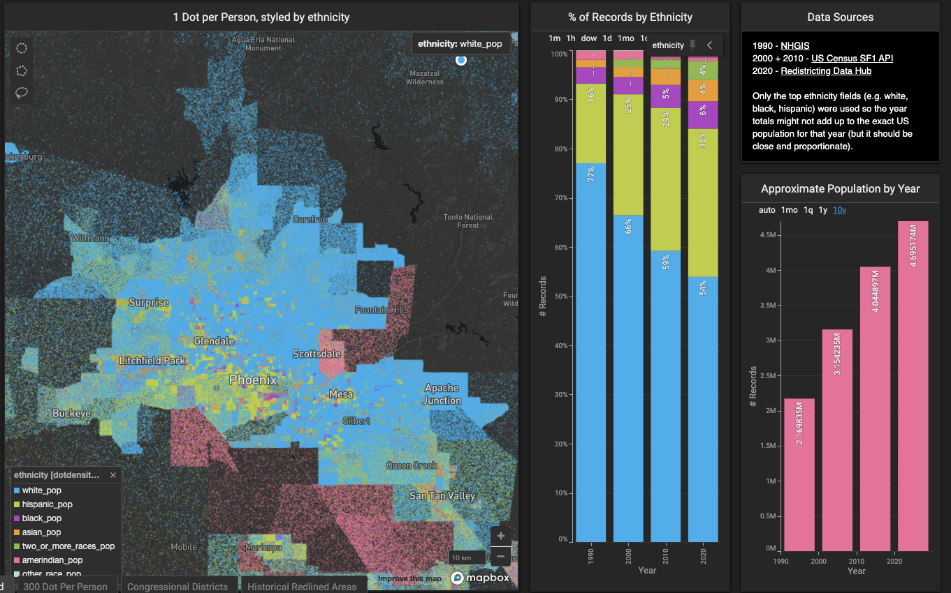
Metro areas like Phoenix have seen considerable increases in population.
While areas like downtown Detroit have seen declines.

New Neighborhoods Popping Up
Using the 'Approximate population by Year' New Combo Chart allows brushing through the different years of census data. Going from 1990 to 2020 shows you how neighborhoods and cities have changed over time.
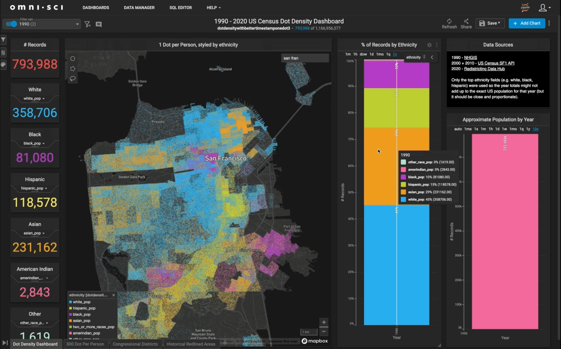
It's fascinating to see areas of cities that used to have no one living in them suddenly become new neighborhoods. The graphic below shows how the Mission Bay and SOMA areas of San Francisco added housing over the decades.
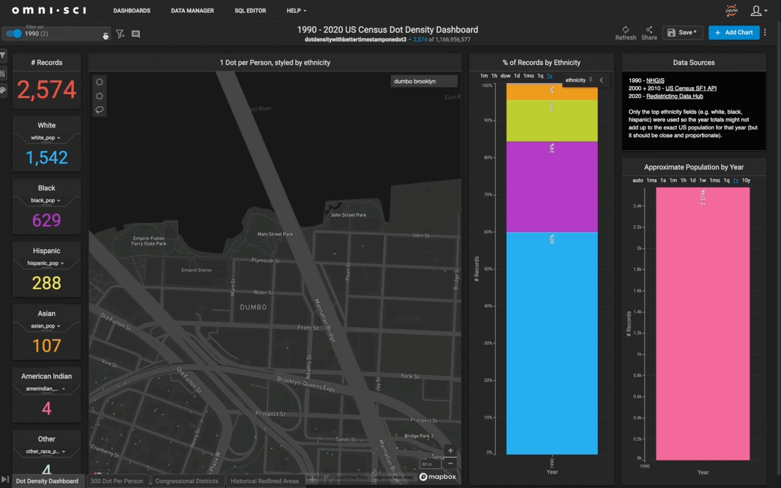
A similar thing happened in the DUMBO area of Brooklyn, NY.
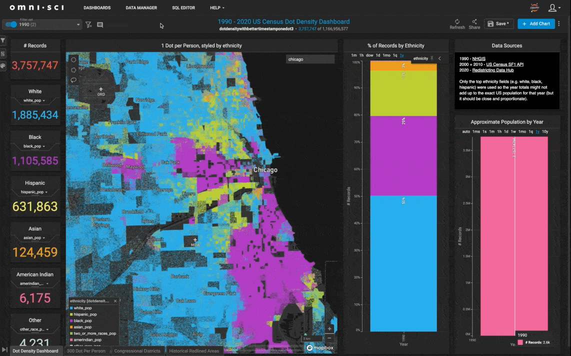
Chicago has multiple blocks that were empty in 1990, fill in with residents by 2020.
Demographic Shifts
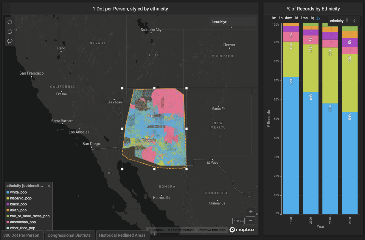
When zoomed out, we can see how much the overall white population percentage has declined while the Asian, Hispanic, and two or more races have increased.

It gets even more interesting to see how these demographic shifts play out on a regional or city level. The above trend, for example, is much more noticeable in a place like California.

And Arizona…
Gentrification and Displacement
The previous three decades have been an era of rapid urbanization across much of the US. One unfortunate part of this has been the displacement of prior, often marginalized community residents from many urban cores.
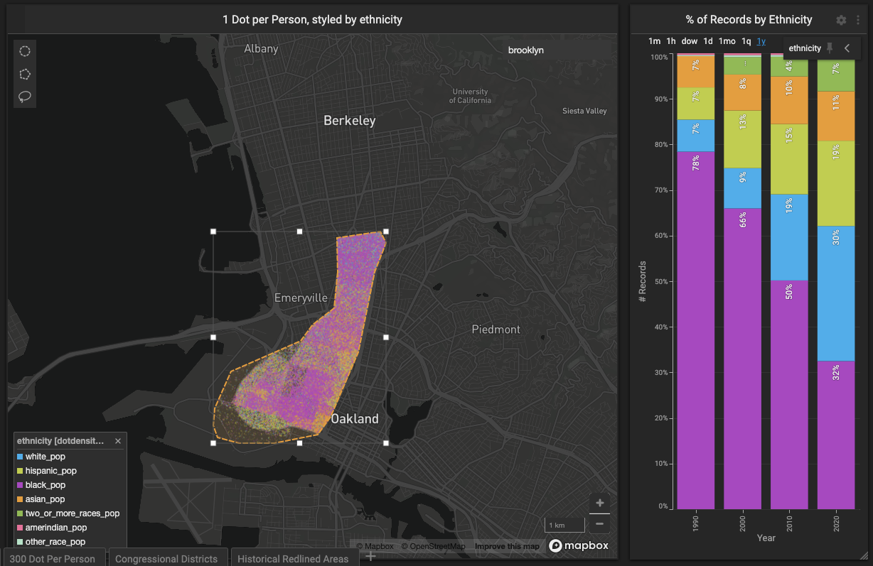
The dashboard shows just how drastic this has been in some neighborhoods. West Oakland, for example, went from 78% black to 32% black (percent of the total population) over the previous three decades.
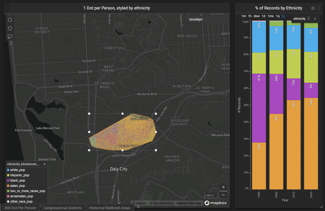
The Ocean View and Ingleside areas of San Francisco went from nearly half black to single-digit percentages in that period.
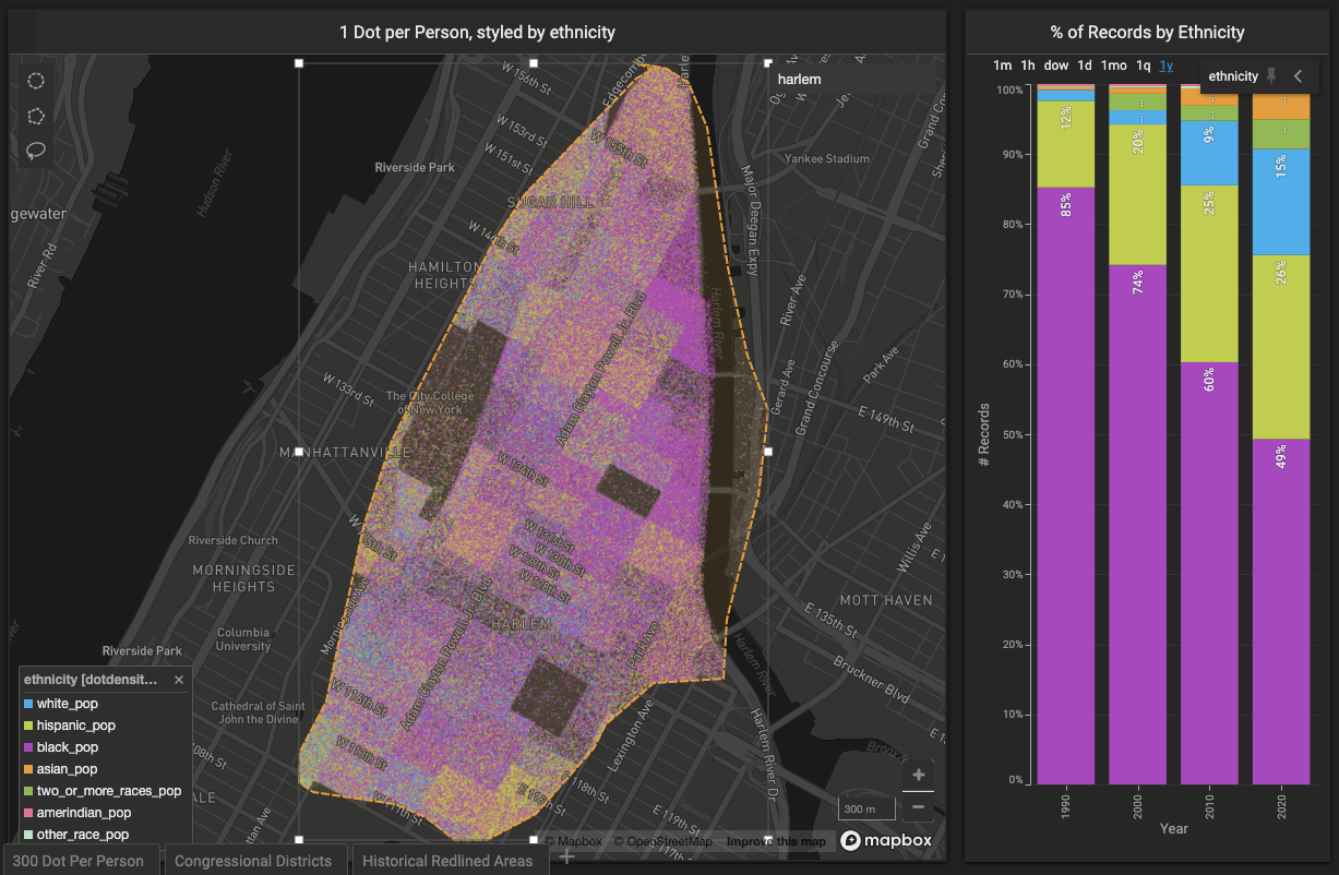
Harlem, New York, saw a similar pattern.
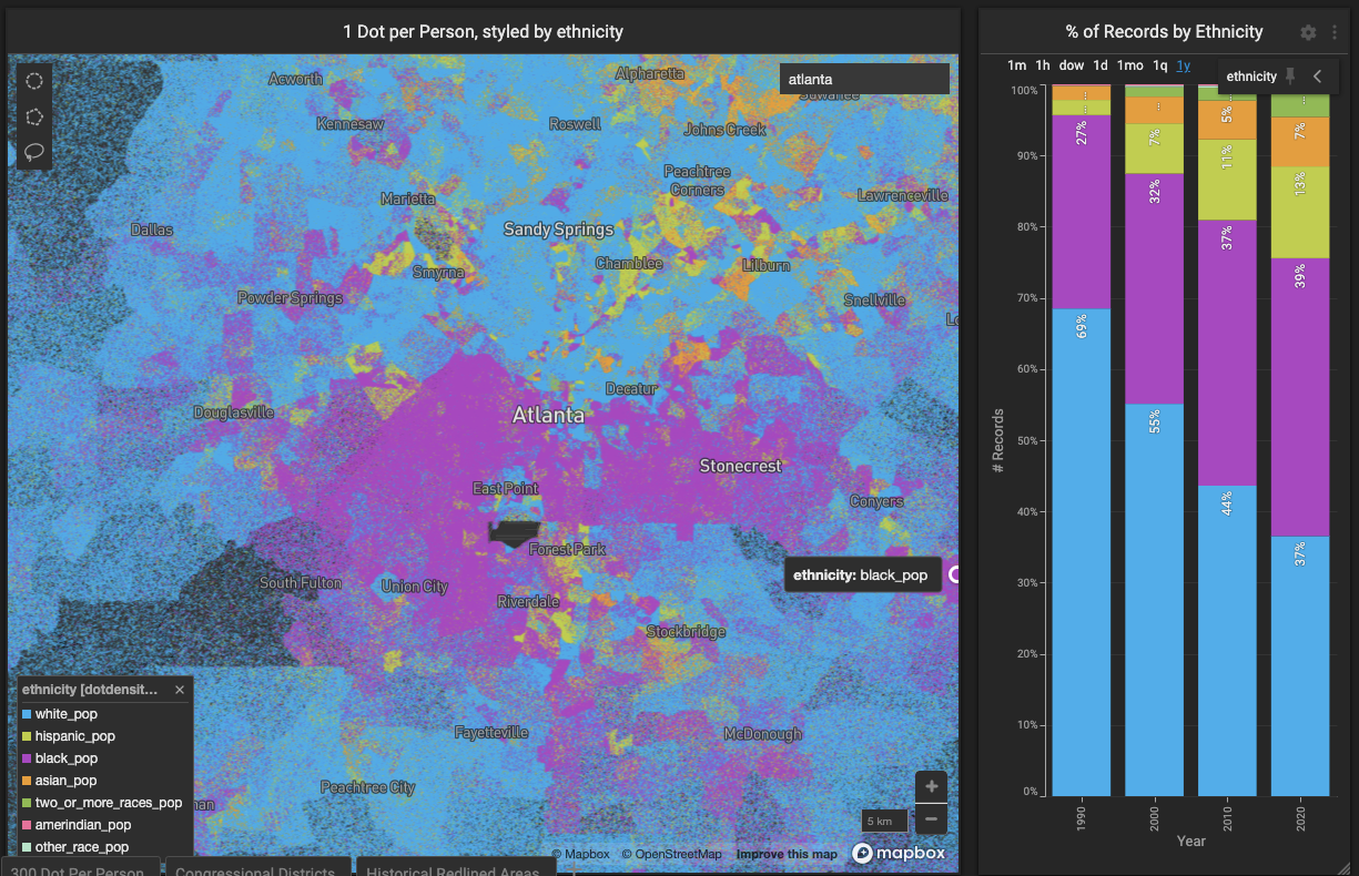
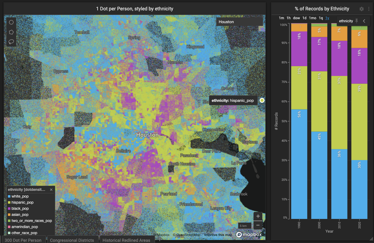
Meanwhile, places like Atlanta and Houston saw their black populations hold steady or increase.
More Questions Than Answers
Having all of this data in one place will further the types of conversations we can have about population and demographic shifts, and even census undercount. As with any proper data exploration project, this one provides at least as many questions as answers. Here are some other things worth exploring, perhaps in future pieces:
- How have the origin countries of different Hispanic immigrants changed over time? It would be interesting to see the patterns that come up after visualizing census data variables like 'Total!!Hispanic or Latino!!South American!! Venezuelan' or 'Total!!Hispanic or Latino!!Central American!!Salvadoran'.
- How has the median or per capita income changed over time? We could style the point size according to these variables and probably see some fascinating results.
- Similarly, how would census data variables like age, employment status, owner vs. renter play out in this sort of visualization?
- The decennial census features hundreds of variables, and most of them would be interesting to visualize in a dot density plot format.
We'd love to hear about your findings once you’ve used the dashboard, as well as any feedback you may have. Please share those thoughts and experiences with us on LinkedIn, Twitter, or our Community Forums!