
12 Data Visualization Color Palettes for Telling Better Stories with Your Data
Try HeavyIQ Conversational Analytics on 400 million tweets
Download HEAVY.AI Free, a full-featured version available for use at no cost.
GET FREE LICENSENOTE: OMNISCI IS NOW HEAVY.AI
Telling compelling stories with data can be pretty tricky.
We've all spent considerable time engineering data, conducting analysis, and preparing results, only to struggle with practical data visualization techniques and tools.
Perhaps the tools made it easy to visualize data clumsily or produce an imbalance between aesthetics and understanding. A common way to misrepresent information is an incorrect use of color or data visualization color palettes.
The colors we use in maps and charts play a significant role in the effectiveness of our message. A poorly crafted or improperly used palette can confuse an audience, while sound dashboard color palette choices communicate data and analysis results with clarity.
This post highlights the following:
- 12 of the best color palettes for data visualization that can improve your maps, charts, and stories
- When you should use each of the dashboard color palette types
- How to add new colors and palettes to your dashboards
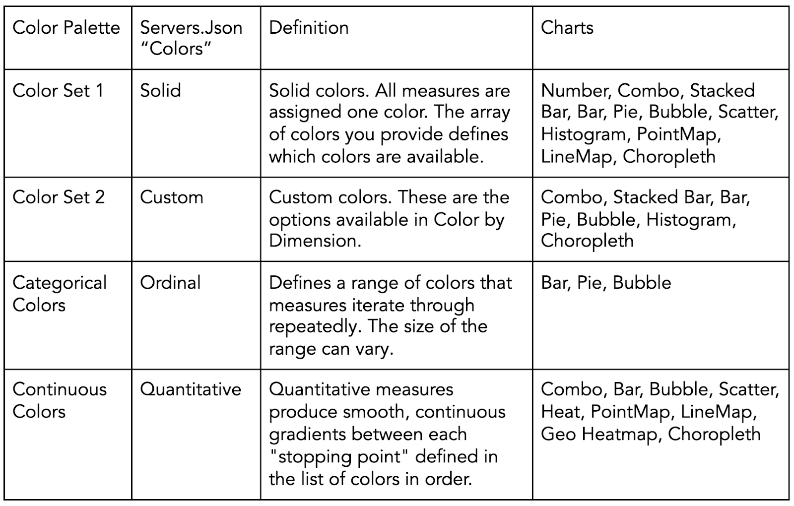
Types of Color Palettes for Data Visualization
There are many different types of color palettes for dashboards, but not all work in every situation. The kind of map or chart color palette a practitioner should use depends on the data's characteristics. Three essential data viz color palette types to consider when using Immerse are;
- Categorical
- Sequential
- Diverging
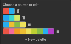
Categorical Color Palette
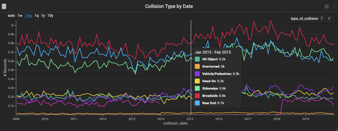
Use a categorical color palette when the data variable has distinct labels and no natural order. For example, the Collision Types by Date chart above applies a single color to each of the possible collision types found in the dataset.
Categorical palettes should be limited to 10 unique colors with little hue and saturation similarities. The more colors, the more difficult it is to comprehend the visualization, and color combinations close in hue and saturation are challenging to distinguish from one another.
Immerse allows for colors to be looped through more than once, but it's more effective to isolate the significant labels and apply a neutral color like gray to all "Other" values.
1. Retro Metro (Default)

2. Dutch Field

3. River Nights

4. Spring Pastels

Add these data visualization color palettes to the categorical colors and color set 1 and 2 in the Immerse UI Settings Panel's colors section (see Adding Colors and Palettes to an Immerse Dashboard later in this post).
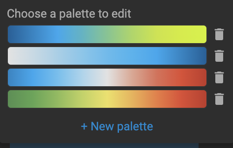
Sequential Color Palette
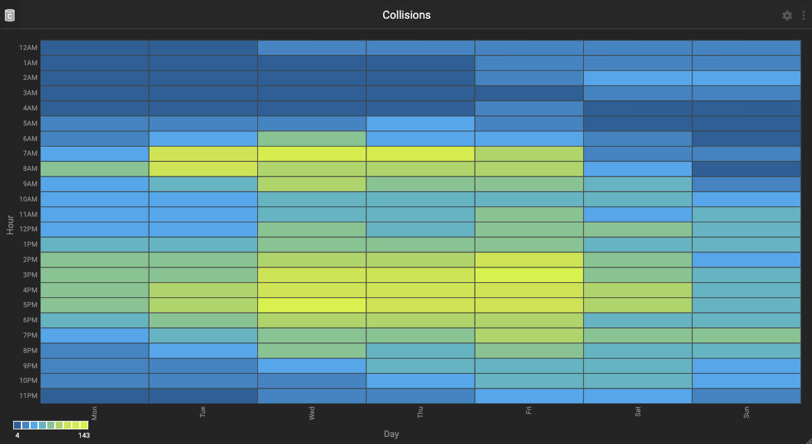
Apply a sequential color palette when the variable is numeric or possesses naturally ordered values. For example, in the Collisions by Day and Hour heat map above, the number of collisions are sequentially ordered from least (blue) to most (yellow).
Sequential color palettes assign colors to values gradually based on lightness in single or multiple hues. Utilize light to dark sequential palettes when using a light-themed dashboard and dark to light colored choices with the dark theme. Doing so calls attention to the highest values in either palette
5. Blue to Yellow (Default)

6. Grey to Red

7. Black to Pink

8. Blues

Add these palettes to the continuous colors in the Immerse UI Settings Panel's color picker section (see Adding Colors and Palettes to an Immerse Dashboard later in this post).
Diverging Color Palette
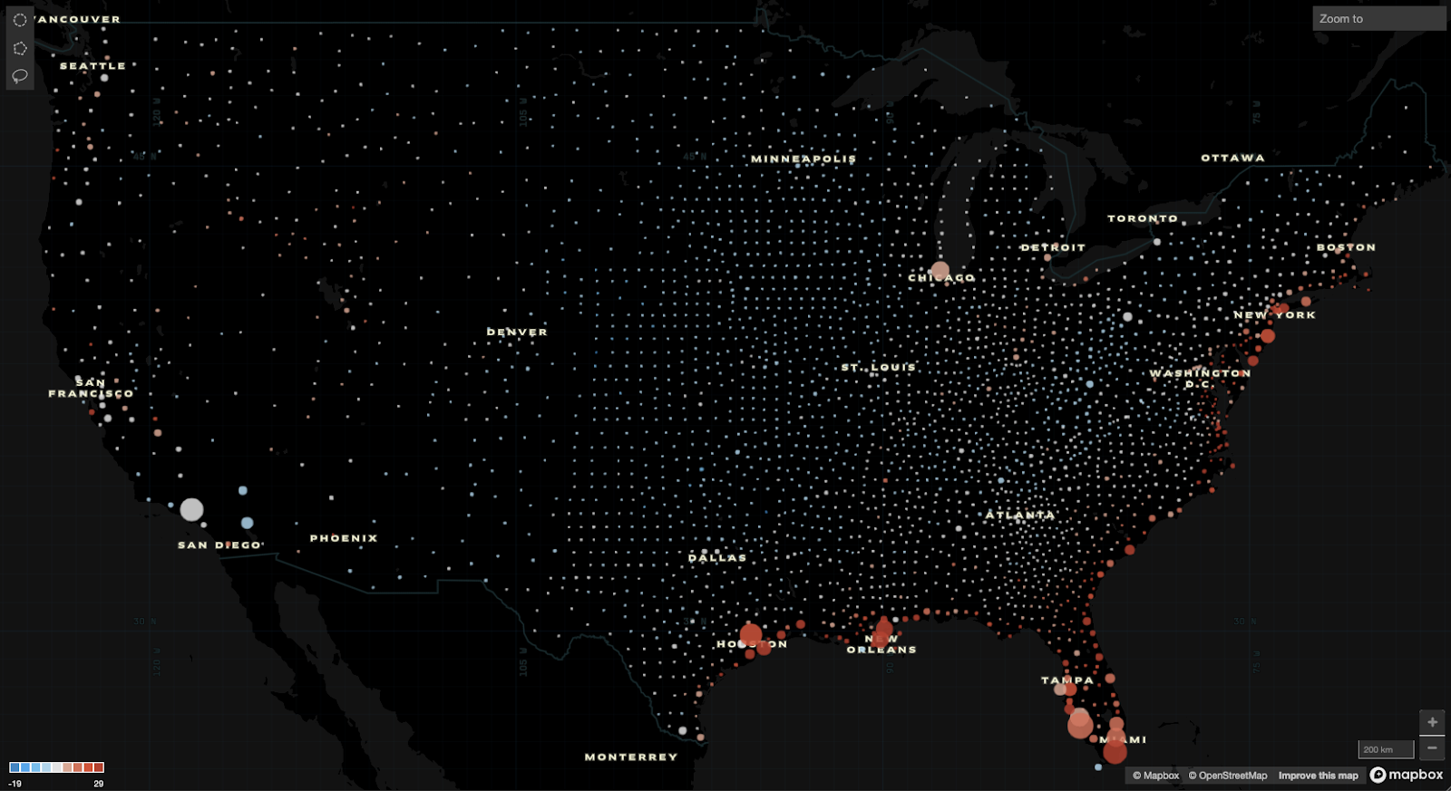
Percentage Change Over Time and Properties at Risk of Flood by County in 2050
Employ a diverging color palette when the variable is numeric and has a significant center value. The map above represents percentage values higher and lower than zero. Percentage change over time is an excellent example of when diverging palettes highlight two distinct trajectories or trends.
A diverging color palette is composed of two sequential palettes that share an endpoint and assigns easy to distinguish sequential colors to values that fall on either side of the center. The center values demand muted colors with low saturation and brightness similar to low values in sequential palettes to make the extremes pop.
9. Blue to Red (Default)

10. Orange to Purple

11. Pink Foam

12. Salmon to Aqua

Add these data color palettes to the continuous colors in the Immerse UI Settings Panel's colors section (see Adding Colors and Palettes to an Immerse Dashboard next in this post).
Adding Colors and Palettes to an Immerse Dashboard
Implement the business dashboard color palettes above in individual Immerse dashboards through the UI settings panel or change the instance defaults through the servers.json file. This example focuses on editing, adding, and deleting colors and palettes within Immerse.
Start by opening the UI settings panel on the left-hand side of an open Immerse dashboard.
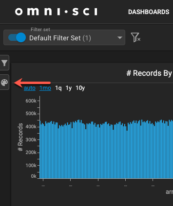
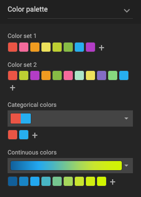
The color palette section of the UI settings panel has four subsections.
- Color Set 1
- Color Set 2
- Categorical Colors
- Continuous Colors
Click the plus icon (+) in Color Set 1 or 2 to edit the palette, add the hexadecimal value for the color, and click the Save icon to add the color.
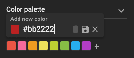
To change or delete an existing color in Color Set 1 or 2, click the color, change the hexadecimal value for the color, or click the Delete icon. Each set must have at least one color.
In Categorical and Continuous colors, a user can add a new palette, edit an existing palette, or delete a palette.
Click the dropdown to see available palettes and options for adding, editing, or deleting. Each palette must have between 2 and 10 colors.
Click a palette to add, change, and delete colors as we did for Color Set 1 and 2.
Save the dashboard and enjoy the new colors at your disposal.
That's it! Twelve data visualization color palettes to improve your maps, charts, and stories, when you should use each of the dashboard color palette types, and how to add new colors and palettes to your dashboards.
Try for yourself today, download HEAVY.AI Free, a full-featured version available for use at no cost.
What colors and palettes are you planning to add to Immerse? Share them and any visualizations you create with us through LinkedIn, Twitter, or our Community Forums.